Sign In
 29.04.2014
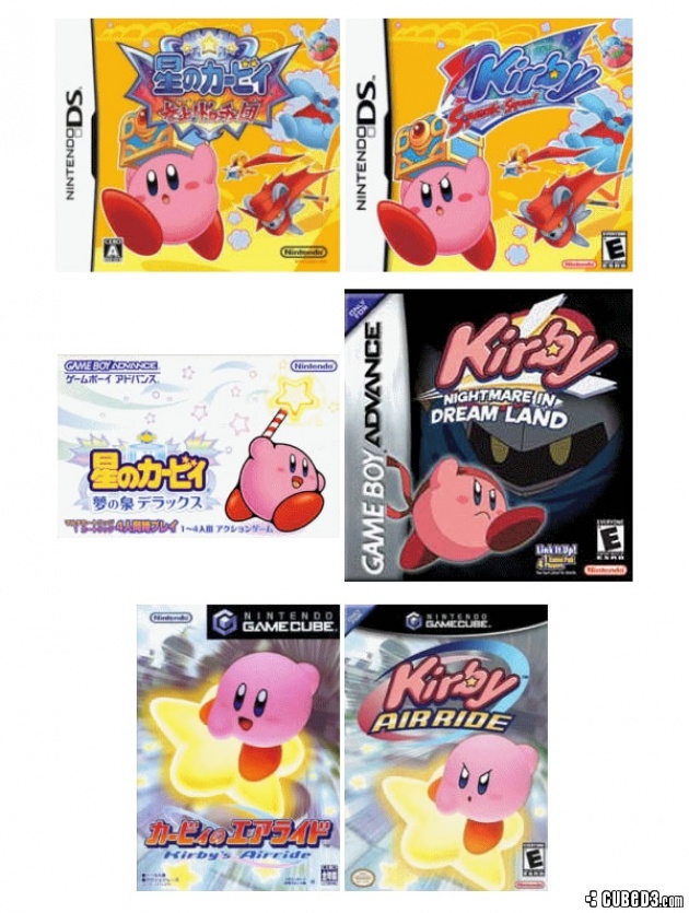
Shinya Kumazaki, director for Kirby Triple Deluxe, explained why Kirby looks angrier on US boxart.
Throughout the years, the pink puffball has always had a more angry look and slanted eyebrows, compared to the more cutesy Japanese design. Speaking to GameSpot this week, Kumazaki said the "cuteness is his biggest draw in [the Japanese] market."
As for the US, Nintendo of America feels that the "strong, tough Kirby that's really battling hard is a more appealing sign of Kirby, so that's what we feature in the US."
Oddly enough, the boxart for Kirby Triple Deluxe uses the same, angry look in both regions.
Do you think an angrier, "tougher" Kirby is more appealing for Western audiences?
 Game Details
 Read Review
 Screens
 Out now
  Out now
  Out now
  Out now Also on
 Agul
Agul 
 Link to this post:
  Subscribe to this topic
 Features


 Top
Top