Shutter (PC) Review
By Thom Compton  28.04.2016

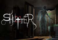
This is an interesting proposition indeed. Is it possible to be scared knowing you can't be hurt? Shutter is a game where a player explores creepy settings from the safety of a remote location, leaving the heavy work to a small robot camera. It feels like the kind of experimental title that PCs had an abundance of in the 90s. However, it's enough to wrap us in horror nostalgia. Horror games aim to consume us with fear, and unfortunately Shutter misses that mark entirely.
The opening of Shutter is almost arduous enough to ruin the entire experience. Leaving the safety of your box, the controls seem to be having an identity crisis. With one half Resident Evil clunky, one half twin-stick shooter aiming system, it's clear that piloting your little drone is going to take some practice. The game allows you to take pictures with the drone and teaches you how through a vague bunch of scribbling on the back wall of your starting point and a calibration test. The calibration test is more a test of patience, as the player is very poorly informed of when they need to take the picture, which leads to multiple retries.
After finally escaping the crate, you will find your way into a creepy house. Here, you'll employ point and click-style puzzle solving, which actually makes sense. Exploring the house is interesting, and the tone is definitely one of moroseness. Something very bad has happened here, and it's very evident. The player is tasked with taking photos and emailing them back to the offsite help, who will frequently remark, "What am I looking at?" or something else wholly unhelpful.

The game is a practice in ambient fear, with mostly mildly creepy jump scares littered within. Some of the scares that were most effective also look the most…off. A book vibrating on a book shelf is creepy when a photo is taken and it is clearly not there any longer. However, it also just looks glitchy and unintentional. This isn't a bad thing a lot of the time, because the game is using an art style that kind of complements this. Using the 90s-style, almost barebones polygon approach of games like Myst or Encarta's MindMaze, the glitchy look actually breaks the fourth wall. The game feels like it is attempting to speak to you, screaming for help. This was probably not the point, but the end result is interesting.
Unfortunately, those moments are few and far between, which puts them in short supply when you consider that the game can be beaten in under 10 minutes. There's even an achievement for it. Had this been more fleshed out, it could have felt like a much more cohesive experience. Unfortunately, with such a short run time, it feels like a trailer for a bigger product, one which is saving the good scares for later on. The remainder of the gameplay seems split between sending and receiving emails and journeying back and forth from one location to another to experience whatever the game is attempting to convey.

Cubed3 Rating
Average
Retro aesthetics are starting to aim for the 90s, and Shutter brings that beautiful, low-res polygonal structure to the forefront. The problem is that it doesn't feel like a full experience. With annoying and clunky controls, a handful of subpar jump scares, and little to actually do, this is more of a trailer for missed opportunities than a fully realized game. The concept of taking photos of creepy areas could have been more, but Shutter seems content just letting the whole thing be.

![]() 5/10
5/10
![]() 0
(0 Votes)
0
(0 Votes)
 Out now
  Out now
  None
None  Out now
 Comments
Comments are currently disabled

 Sign In
 Game Details
 Subscribe to this topic
 Features


 Top
Top

