Nintendo Wii Media | More Zelda: Twilight Princess Screens

By Jorge Ba-oh 04.11.2006 86

In addition to the heap of Zelda updates this week, Nintendo have revealed some gorgeous new screens from Twilight Princess (Wii), revealing some brand new areas, characters, enemies and weaponry.

Be sure to check out more screens from this update in the game's Screens Album.

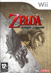
Box art for The Legend of Zelda: Twilight Princess
Developer

Nintendo

Publisher

Nintendo

Genre

Action Adventure

Players

1

C3 Score

Rated $score out of 10  10/10

Reader Score

Rated $score out of 10  9/10 (827 Votes)

European release date Out now   North America release date Out now   Japan release date Out now   Australian release date Out now   

Comment on this article

You can comment as a guest or join the Cubed3 community below: Sign Up for Free Account Login

Preview PostPreview Post Your Name:
Validate your comment
  Enter the letters in the image to validate your comment.
Submit Post

Comments

Marzy said:
I would, your telling me you didnt play Ocarina of Time, Lylat Wars, Super Mario World or all the other great games out there on NES, SNES AND N64.( Edited on 04.11.2006 20:58 by Marzy )

In a game, graphics and music alone give emotion. If it looks like crap, you don't have any empathy or connection with the characters.

Martin said:
Marzy said:I would, your telling me you didnt play Ocarina of Time, Lylat Wars, Super Mario World or all the other great games out there on NES, SNES AND N64.( Edited on 04.11.2006 20:58 by Marzy )
In a game, graphics and music alone give emotion. If it looks like crap, you dont have any empathy or connection with the characters.

Exactly.

Typical stereotype of gamers these days. Your not real gamers your the boring gamer who doesn't like to have fun but trades it for things we see in the real world in everyday life. Why stare at game when you can look at lush fields outside. Games are meant to be diffrent and Nintendo achive that by consentrating on gameplay not graphics.

You don't get it do you.

I'm not gonna bother anymore. You don't have to be a graphics whore to like good graphics. You seem to think I value graphics over gameplay. I DON'T. But I also recognise that good graphics can vastly improve a game.

Oh and, what kind of gamer goes outside? I think YOU are the one who isnt a true gamer Smilie

Marzy said:
Typical stereotype of gamers these days. Your not real gamers your the boring gamer who doesnt like to have fun but trades it for things we see in the real world in everyday life. Why stare at game when you can look at lush fields outside. Games are meant to be diffrent and Nintendo achive that by consentrating on gameplay not graphics.

Marzy, Yesterday:

Image for

You don't get it do you

Smilie

Oh and Martin I totally dont get what that picture is ment to mean. Please tell?

( Edited on 04.11.2006 21:13 by Marzy )

Nintendo achive that by consentrating on gameplay not graphics.

In my experience they consentrate on both as much as any developer, hence why Nintendo games are almost always up to date graphically as well as being good quality generaly.

It's imagination that Nintendo lacks most these days, and ironically - gameplay innovation.

It's going to be shit and you jolly well know it.

Yeah exactly. As I've said COUNTLESS times, Nintendo games always look good. Just look at 1st party games on the GC like MP.

You know, it's not smart to try and be arrogant and think you're special because you like gameplay over graphics.

Every one thinks the game looks good marzy it just has a few weak points but overall it looks nice.
Were just discussing it not ripping it apart.

( Edited on 04.11.2006 21:18 by Blade2t3 )

XBL Gamertag: James2t3

Why not have a game with good gameplay and good graphics?

But they are good Smilie They just don't pull off some textures aswell as other games.

Responding to Amazingjanet's comment (and Grumbler's RE4 pictures), Zelda seems really detailed except for the floor and the odd moutain in the background. Add to that all of the NPCs carrying on their daily lives and the amount on screen at one time.

RE4 did look great, but that had issues which you didn't show in those screenshots. For example, I remember Oni-Ninja ages ago saying that details like the background at the castle, the curtains at the castle and generally everything in the background was like a low-res image. Corners had to be cut and it seems to me that the corners cut in Zelda are (unfortunately) more obvious and evident in these screens.

360 Gamertag: shiptoncraig
PSN: shiptoncraig
Steam: Guess what?

Oh and Martin I totally dont get what that picture is ment to mean. Please tell?

"La la la, I'm not listening"

You don't seem to read what people are actually saying.. Knighty posted "Why not have a game with good gameplay and good graphics?", yet you seem to ignore it.. I posted that some games need good graphics (and sound) to have a proper sense of immersion, yet you seem to ignore that.

edit-

Also, as Blade says.. we're not saying Zelda looks bad, we're just discussing a few areas where there are some flaws.

( Edited on 04.11.2006 21:20 by Martin )

God conversations about graphics are dull! Texture compression this. Draw distance that. Lighting effects the other. Poly count, character models, blah, blah, blah, blah.

Ask yourself this: will someone who knows nothing about gaming and isn't comparing the clarity of the textures on this to some 360 game really give a shit? In other words, at a glance (you know the kind of glance where you're playing but concentrating on what you're doing, not what the grass looks like), is it pretty? I think the obvious answer is an emphatic yes!

"This man has advanced communist views ... He dresses in a bohemian fashion both at his office and in his leisure hours."

Who gives a shit what some stupid non gamer who bought a Wii for wii sports thinks?

Marzy said:
Im not bothered about graphics and im all for gameplay over graphics but im just saying it is because it is. Im not going to lie.

Like I said the graphics are good I didn't say that but I think gameplay is more important over graphics.

stupid non gamer

Umm... non-gamers aren't stupid they just haven't played a game before.

( Edited on 04.11.2006 21:29 by Marzy )

So does everyone here.

Dr_R said:
God conversations about graphics are dull! Texture compression this. Draw distance that. Lighting effects the other. Poly count, character models, blah, blah, blah, blah.Ask yourself this: will someone who knows nothing about gaming and isnt comparing the clarity of the textures on this to some 360 game really give a shit? In other words, at a glance (you know the kind of glance where youre playing but concentrating on what youre doing, not what the grass looks like), is it pretty? I think the obvious answer is an emphatic yes!

Thepoint is, there are lots of good textures in the game, which clash horridly with the bad ones, which makes it noticeably odd to look at in some areas. You're walking through some amazingly rendered area and then suddenly you enter a cave made of 3 polygons with a covered with few textures that look like they've been nicked from a Dreamcast graphics library.

Oh and i also don't give a shit what non-gamers think. This is one Nintendo game that is for me and us!

It's going to be shit and you jolly well know it.

Grumbler said:
Dr_R said:God conversations about graphics are dull! Texture compression this. Draw distance that. Lighting effects the other. Poly count, character models, blah, blah, blah, blah.Ask yourself this: will someone who knows nothing about gaming and isnt comparing the clarity of the textures on this to some 360 game really give a shit? In other words, at a glance (you know the kind of glance where youre playing but concentrating on what youre doing, not what the grass looks like), is it pretty? I think the obvious answer is an emphatic yes!
Thepoint is, there are lots of good textures in the game, which clash horridly with the bad ones, which makes it noticeably odd to look at in some areas. Youre walking through some amazingly rendered area and then suddenly you enter a cave made of 3 polygons with a covered with few textures that look like theyve been nicked from a Dreamcast graphics library.Oh and i also dont give a shit what non-gamers think. This is one Nintendo game that is for me and us!

What I mean is, chill out a bit, stop looking for things to upset you about the graphics, and it looks very, very good. In other words, I think people are getting needlessly upset by little details that, to me, don't seem to matter much, or affect my belief that the game looks beautiful.

"This man has advanced communist views ... He dresses in a bohemian fashion both at his office and in his leisure hours."

I wouldn't take them seriously if they were released now (graphically wise)

Not a big fan of the DS Lylat Wars title then? Smilie


Cubed3 Staff [ Retro Editor :: Previews Editor ]

Starfox Command looks awful. Considerably worse than Lylat Wars.

Dr_R, people are just discussing the game. We've all wanked on and on about how fantastic it's going to be, and how much we can't wait for it, and there's really little else to be talked about other than things we don't like, are worried about, etc. It's when people say things like..

Dr_R said:
will someone who knows nothing about gaming and isnt comparing the clarity of the textures on this to some 360 game really give a shit?

What has that even got to do with anything? Now, I've read this whole thread, and you're the only person who's even mentioned the Xbox 360. No-one's comparing 'Twilight Princess to anything but older Nintendo-platform games. Once again, you come bowling in telling everyone what to think. And you accuse other people of trolling? Hush.

shiptoncraig said:
For example, I remember Oni-Ninja ages ago saying that details like the background at the castle, the curtains at the castle and generally everything in the background was like a low-res image. Corners had to be cut and it seems to me that the corners cut in Zelda are (unfortunately) more obvious and evident in these screens.

Dude, I remember that! Yeah, RE4 was really fucking gorgeous, but if you ever really take the time to look around, you find that the gorgeousness is actually just a thinly-veiled illusion, and if you look at things you weren't supposed to, you see some really crude graphics, and stuff.

For example, in the castle, if you look out of any window, not only can you see a blatent single flat huge polygon with a low-res scenery texture on it, but you can actually see where the polygon ends, and stare into utter nothingness. Capcom never thought I'd bother to properly look out of that window, and never thought I'd notice the mockery of a scenery, but I did.

In that instance, I believe Capcom cut corners to improve/ensure performance. I think that is also the case here. If this Zelda really is as huge as they say it is, then I can turn a blind eye to some ugly textures. If Nintendo are smart, they would have taken a leaf out of Shenmue's book, and made some utterly beautiful design, despite some low-res tex'.

I think 'Twilight Princess is a stunning looking game, the GC is just showing it's age abit, that's all.

( Edited on 04.11.2006 23:01 by Oni )

I think the game looks beautiful. The level of beauty is certainly acceptable and when you add the music, control and seeing it actually running on the tv in front of you, you'll forget all about the textures and see it for what it really is. A magnificent piece of art and quality gameplay.

knighty said:
Oh fuck off.Graphics are an integral part of any game. Zelda has always looked ace. Like all Nintendo games. You think you would enjoy a game so much if it looked like shit? No you wouldnt.

How about you fuck off, seriously mate you start of every fucking comment with fuck off.

if you have that graphics over gameplay mentality you definitley own an Xbox 360, that is all MS fanboys talk about yeah the graphics so fucking what. However I do agree nice graphics are a bonus.

I agree with marzy on most of his comments except the one on RE4, the graphics on that game were the best of the last generation titles

( Edited on 05.11.2006 00:19 by Mr.Ashcroft )

EDIT; didn't really there was a third page so ignore most of commment

( Edited on 05.11.2006 00:26 by Mr.Ashcroft )


Mike Gee of iZINE said, "...The Verve, as he [Richard Ashcroft] promised, had become the greatest band in the world. Most of the critics agreed with him. Most paid due homage. The Verve were no longer the question mark or the clich�. They were the statement and the definition."

Ah finaly Mr. Ashcroft (who I view as a father/god figure, and is quite a dish also with a huge cock) arrives and sorts everything out with his intelligent, considered arguments. God be praised for people like him, or we'd all be doomed.

If Nintendo are smart, they would have taken a leaf out of Shenmue's book, and made some utterly beautiful design, despite some low-res tex'.

The beauty of Shenmue is it's varied textures, hardly anything is recycles, and there are detailed little individual textutres on so many things that most games ignore. You walk down some humble alleyway and there's stuff going on everywhere. under a partialy closed shutter you can see a man moving boxes, you look up and you see highrise apartments with a unique texture for every window and cables and washing lines draped in between, and that's without even mentioning the colourful shops with all their wares on display outside and dozens of NPCs all doing different things, but no one is walking around aimlessly. They all have a departure pint and a destination. I don't think Nintendo have really tries that sort of thing before besides the non-aimless NPCs in MM, but it has an amazing effect. Can't wait to see the towns in TP, some of the screens make them looks pretty crowded and detailed.

It's going to be shit and you jolly well know it.

Lol this thread is quite funny. Imagine that you had nothing to do with games whatsoever and stumbling across this webpage. People would piss themselves with laughter at the extent that people are arguing over something that isnt even their own work...

....some would call it true devotion...

graphics whores to the left of us
Nintendo fan boys to the right of us
and stuck in the middle with Grumbles Smilie

Ahhh geeks Smilie

I think it looks better than any GC by far, but I agree with Gumbler saying that the game's graphics aren't that good. Zelda looks pretty average in the shots, and looks a hell of a lot better in motion. As gumbler said, ninty used heaps of lighting and special effects to hide the ugly parts of the game, and it works to be honest. When the game is in motion, stuff like bloom kind of blur the jaggies. That's my two cents anyway. Its a supurb looking game, whatever you may say. It purely looks good.

Subscribe to this topic Subscribe to this topic

If you are a registered member and logged in, you can also subscribe to topics by email.
Sign up today for blogs, games collections, reader reviews and much more
Site Feed
Who's Online?
oroblram, Sandy Wilson

There are 2 members online at the moment.