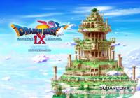
Are you a super sleuth and noticed the slight change in the Dragon Quest IX logo for localisation? Here may be the reason why.
Dragon Quest IX: Sentinels of the Starry Skies, the Nintendo DS-exclusive installment in the series' main timeline, has two publishers. Nintendo handles the European PAL and North American releases, whilst Square Enix does distribution in the home turf of Japan.
You may have not noticed that despite the usual artwork changes and other minor bits, the logo for "Dragon Quest" is different in the English release. Gone is the sword that makes up the "T" in "Quest". Instead it's replaced with a regular, not-as-sharp letter T.

Square-Enix's Yuji Horii and Level-5's Noriyoshi Fujimoto were recently quizzed on the change revealing that "some people said that what they heard from Nintendo was that having the sword as a T was a little childish", and that it was Nintendo's decision to omit the sword.
Fellow Wii game Dragon Quest Swords also has similar sword-less treatment.
Often publishers try to make logos with clearly defined letters, and whilst being "childish" could be one of the reasons, perhaps it was to make the game's branding easier to identify.
Which logo do you prefer - is it even a problem?

 Sign In
 27.05.2011

 Link to this post:
 RudyC3
 Subscribe to this topic
 Features


 Top
Top

