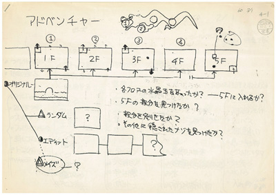
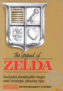
Over 20 years ago Nintendo designed one of the most popular video game adventures, The Legend of Zelda. Original drawings await..
The latest Iwata Asks roundtable brings together key figures in Zelda's history, looking at the original NES outing - dungeon, over-world and enemy designs, a blueprint for a Hyrule that we all know and love (and seemingly replicated in later games).

Back then we had some long paper, and Tezuka-san and Miyamoto-san would sit side by side and draw together. You drew the stuff on the left, Tezuka-san, and the right side is Miyamoto-san's.If you look closely, you can tell how a marker was used to make small dots. These are rocks, and these are trees. And you can see Miyamoto-san's personality. At first he's making individual dots, but as he gets tired of it, toward the top, he just fills in a bunch of space!

The trio also discuss The Legend Of Zelda: Link's Awakening, how it began as an "afterschool activity" whilst putting the finishing touches to the equally popular SNES epic A Link to the Past. As the team had intended it to be more of a side project, a bit of fun, there was a lot less pressure to live up to the console games and greater room for experimentation - a new world, characters, structure - something fans still enjoy and some even hope for.
It was also the first Zelda game with a trading "Straw Millionaire" sidequest and what Nintendo feel had a "proper plot": characters having deeper relationships and more involvement with your quest, essentially broadening what was acceptable to use in future titles.

We moved along at quite a good speed in a relatively freewheeling manner. Maybe that’s why we had so much fun making it. It was like we were making a parody of Zelda.

What do you think of the original Zelda designs and Link's Awakening? Do you feel this "free thinking" approach should be used in future Zelda games, where anything and almost everything is acceptable to use - instead of having to follow past games so closely.

 Sign In
 28.01.2010
 Game Details
 Out now
  Out now
  Out now
  Out now
  PMD
PMD 
 Link to this post:
  Subscribe to this topic
 Features


 Top
Top

