Sign In
 Reply
Reply New Topic
 Alert Mods
 Search Topic
 WP-Final
 Both are great but I think the Euro/US boxart does a better job at displaying the theme of the game.

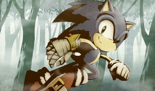
Sonic and the Black Knight, Japanese Box [news]
 Viewing as Guest
Last visit: 24.04.2025
Viewing as Guest
Last visit: 24.04.2025
Welcome to the Cubed3 forums! Join us today - it takes just 20 seconds to start posting!
 Sign Up for Free Account Login
«s previous1next »

 Link to this post:
 I don't know.... the Japanese one is pretty bad-ass.... ![]()
The former top user was Keven! You'd probably give birth to yourself 1000 times over until you sprout wings to fly away into the fading sun, that or you'd just turn into a lesbian. Who knows @_@ - L, 12/06/09
I like this one better, the red background looks cool.
Liking the red BG over the greens/blues! Imo they could have made the box match the in-game style instead of a bog standard Sonic render..
Something like this be sweet!
Cubed3 Admin/Founder & Designer
I think this one is more interesting. That "Rushing into battle" look always works for me. ![]()
Yeah, jb's idea is better then the other boxarts.
But I think I like the European/US the most. It looks a bit less Sonic then the Japanese. The Japanese one gives me the 'it's a plastic-Sonic with phong shading' look.
I find your lack of faith disturbing!
I love the Red background on this one TBH, it really stands out.
Twitter | C3 Writer/Moderator | Backloggery
They are both awsome but this one is better because of the red colour. It stands out really well. it would have been good if we could have had this backround.
SuperYoshi6 PSN name
3DS friend code 2878-9581-8999
Red one is better  but both still great
Nintendo Network ID: LKR000 PSN: LKR000
3DS: 1246-8696-120 GT: LKR101
3DS: 1246-8696-120 GT: LKR101
Wait, what the...?
Isn\'t that just altered Sonic ATSR artwork? O_o
Hm, it\'s slightly different, but it\'s bloody similar...

( Edited 26.01.2009 20:59 by Ikana )
Lol your right, maybe they got lazy
Nintendo Network ID: LKR000 PSN: LKR000
3DS: 1246-8696-120 GT: LKR101
3DS: 1246-8696-120 GT: LKR101
The red background looks niceee.
«s previous1next »
Reply to this topic
 Subscribe to this topic
 Features
-
 News: Picross S Doraemon & F Characters Edition Announced
 News: My Father Lied Kickstarter Announcement
 Nintendo Announces Nintendo Switch 2 Console
 United Kingdom Petition Launches to Prevent Online Video Games from Being Destroyed
 koROBO Hits Initial Crowdfunding Target
- European Union Petition Launches to Prevent Online Video Games from Being Destroyed
-
 Show More


-->
 Top
Top