Fresh Sonic Unleashed Wii Scans

By Shane Jury 20.08.2008 20

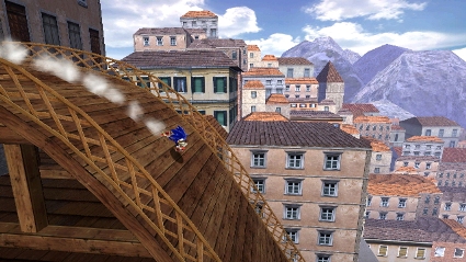
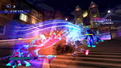
Sega have released a batch of screenshots for the Wii version of Sonic Unleashed, with a notable level of improvement over the original magazine scans.

From SonicStadium;
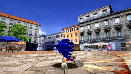
Image for Fresh Sonic Unleashed Wii Scans


Image for Fresh Sonic Unleashed Wii Scans


Image for Fresh Sonic Unleashed Wii Scans


One of the images shows a control option for Were-Sonic, in what seems to be a left-and-right alternating Nunchuk and Remote movement to clamber up a pipe.

Image for Fresh Sonic Unleashed Wii Scans


Be sure to check out the rest of the Screenshots in our gallery below.


Thanks to Superlink for the tip.

Box art for Sonic Unleashed
Developer

Sonic Team

Publisher

SEGA

Genre

3D Platformer

Players

1

C3 Score

Rated $score out of 10  6/10

Reader Score

Rated $score out of 10  7/10 (27 Votes)

European release date Out now   North America release date Out now   Japan release date Out now   Australian release date Out now   

Comment on this article

You can comment as a guest or join the Cubed3 community below: Sign Up for Free Account Login

Preview PostPreview Post Your Name:
Validate your comment
  Enter the letters in the image to validate your comment.
Submit Post

Comments

Hah hah hah hah hah hah.

I told you it looked good. >=[

*buys it*

Twitter | C3 Writer/Moderator | Backloggery

Does look pretty good.
Still prefer this charecter models shadeing over the ps60's.

Lookings like its really a cross between secret rings and sidescrolling...which is perfect for me! Smilie

My only comment against the graphics is the mountines in the background could be cleaned up.
Unless Sonic goes near them, you might as well use some flat, but nicer looking, pictures.


http://www.fanficmaker.com <-- Tells some truly terrible tales.
Last update; Mice,Plumbers,Animatronics and Airbenders. We also have the socials; Facebook & G+

The texture filtering (or lack of it) is atrocious.

this game looks awesome n i might buy

-------Conduit FC=3738-7807-0409----------
--------Cod 5 FC= 3652-5701-8783----------
----------SSBB FC= Coming Soon------------

Looks pretty decent for a WiiS2 games.

XBL Gamertag: James2t3

Gameplay trailer for the 360 version;

27CDB6E-AE6D-11cf-96B8-444553540000\" codebase=\"http://download.macromedia.com/pub/shockwave/cabs/flash/swflash.cab#version=6,0,40,0\" >

( Edited 20.08.2008 18:27 by Phoenixus )

The werehog thing looks retarded.

no way does the werehog look wrong it make sthe game good and spices up

-------Conduit FC=3738-7807-0409----------
--------Cod 5 FC= 3652-5701-8783----------
----------SSBB FC= Coming Soon------------

Aza.M said:
no way does the werehog look wrong it make sthe game good and spices up

Actually Canyarion has a point and when the Werehog first appeared most people reacted negatively, but after seeing some playtests it doesn't actually sound too bad.

Twitter | C3 Writer/Moderator | Backloggery

Wow, it looks a lot better than I thought it would, and these are scans too.

Hopefully Dimps have let their great creativity run wild with the Wii version.

Looks great, sega are really trying with the Wii now aren't they Smilie

Follow Me on twitter :: @Stulaw90 || My Youtube || Backloggery
NNID: Stulaw

The wii version looks average (for wii) , while the 360 version has caught my eye, looks very nice.

Sega need to hurry up and release a trailer. Smilie

Everything looks better in motion, Sonic especialy.


"The texture filtering (or lack of it) is atrocious."

You cant tell at that scale, the resize method used to adjust the jpegs down will swamp out filtering unless its very strong/blury. (which is not what you want).

If we had some full sized pictures we could tell better.

http://www.fanficmaker.com <-- Tells some truly terrible tales.
Last update; Mice,Plumbers,Animatronics and Airbenders. We also have the socials; Facebook & G+

SuperLink said:
Hah hah hah hah hah hah.

I told you it looked good. >=[

*buys it*

It didn't look as good before, but has definitely improved since.

Looks a lot better, they have definitely improved the Sonic model, i.e. given him the highlights back and smoothened him out a little.

Looking forward to it a lot more, definitely. Seems to be improving quite some bit, so hopefully with even more polish and tweaking it'll come out a success.

Cubed3 Admin/Founder & Designer

Darkflame said:
Everything looks better in motion, Sonic especialy.


"The texture filtering (or lack of it) is atrocious."

You cant tell at that scale, the resize method used to adjust the jpegs down will swamp out filtering unless its very strong/blury. (which is not what you want).

If we had some full sized pictures we could tell better.

I know the resizing it causing some of it but I suspect it's not great even with proper shots...

The screens are bigger and of better quality at the original source at Sonic Stadium, go there before you judge them! Smilie

Also, here are MORE Wii SCREENS! Smilie

http://ga-forum.com/showpost.php?p=12481293&postcount=233

This screen here:

http://www.sonicstadium.org/files/posts/2008/08/wii4.jpg

(Copy and paste it into your Address Bar)

Shows Sonic with a real shadow now! So they are gradually improving the graphics! The quick step effect is very close, if not the same as it is in the 360 version!

And that shot shows the characters being darkened by the building' shadow, but in an earlier shot, the springs weren't darkened, but they would be now I imagine.

Overall, I'm quite impressed! Smilie

Also, numerous shots show that the windows may be reflective in a way, to give the buildings more "life"!

It's nice to see they're making improvements (it looked horrible in those first scans). The Sonic model looks way better.

That said, I still don't know how I feel about the whole Werehog thing...

Looks a lot better, still reminds me of flicker of texture-edges on PS2. Wii can do more.
But it comes together nicely.
I still think gameplay may be horrible as with all recent Sonic games. But on the other hand: Secret rings was good, so this one may be, too...

Sonic-model looks great. I hate the Werehog-Thingy, but have to play it to decide to despise it further or like it.
Lighting doesn't look too shabby, textures are crips, too. You recognize, thou, quite some low polygons, i.e. on buildings. But you have to see this game in motion, especially the Wii version! X306 looks okay.

I find your lack of faith disturbing!

The 360 versions looks AMAZING. What are you on about? Jealous?

Subscribe to this topic Subscribe to this topic

If you are a registered member and logged in, you can also subscribe to topics by email.
Sign up today for blogs, games collections, reader reviews and much more
Site Feed
Who's Online?
Ofisil

There are 1 members online at the moment.